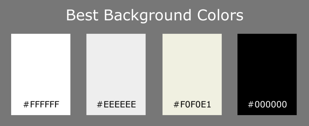
The best color for a church website is….wait for it….wait for it….WHITE!
Wait a second, is white even a color?
In pigment, white is the absence of color, but in light, white is the inclusion of all colors. Of course, websites are displayed as light, but that still doesn’t explain why it’s the best color.
The number one reason to use white is to highlight the visual media on your site. When color is surrounded by white it pops. Neutral colors such as light browns and grays approximate white in their usefulness.
White is not universally the best color, however. There are many situations where other colors are called for:
- If your church does not produce a lot of visually appealing media, then you’ll need to incorporate more colors in the design to add vibrancy to your site. This is often a good strategy for smaller churches.
- If your worship revolves around a theatrical stage instead of a traditional worship space, then you’ll be more likely to consider a dark background.
- If your brand is strongly associated with a color, then you can consider using that color as your primary background color.
To recap, for your primary background color you want white or light shades of neutral colors, or black if you want a theatrical look.
Accent Colors
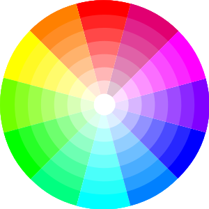
Color Wheel
Accent colors are named as such because you’ll want to use them sparingly so that you don’t distract from the actual content on your site. If you use more than one, make sure they work together. There are three main strategies for matching up colors:
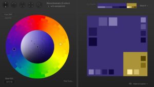
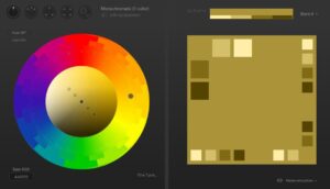
- Monochromatic schemes use different shades of just one color. This is a safe choice because you know the colors will always work together.
- The Complementary scheme is probably the most common strategy for choosing colors. It involves taking two colors from different sides of a color wheel that work great together. Blue and Yellow are the most common example of this on the web.
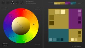
- With Triadic schemes, you make a triangle on the color wheel. Don’t expect any two of the colors to work together without also having the third involved.
Here’s an example of a color scheme that begins with the same brownish base color:
- Complementary
- Monochromatic
- Triadic
Here is a great site I used to create these color schemes.
There are other color theories that utilize more colors. However, the more colors you add, the harder it is to make them work together.
What if you have a good image for your website but it just doesn’t match the color scheme? This is when you’ll want to consider using the color fill option on your graphics editor to adjust the color of your image. Here’s an example of the same image in a triadic color scheme.
We recently added the ability to select color schemes in Aboundant and could use your help to pick our next schemes! Keep your eye out for the upcoming poll.
