Looking for our 2019 rankings? Here’s our current list of the Best Church Websites.
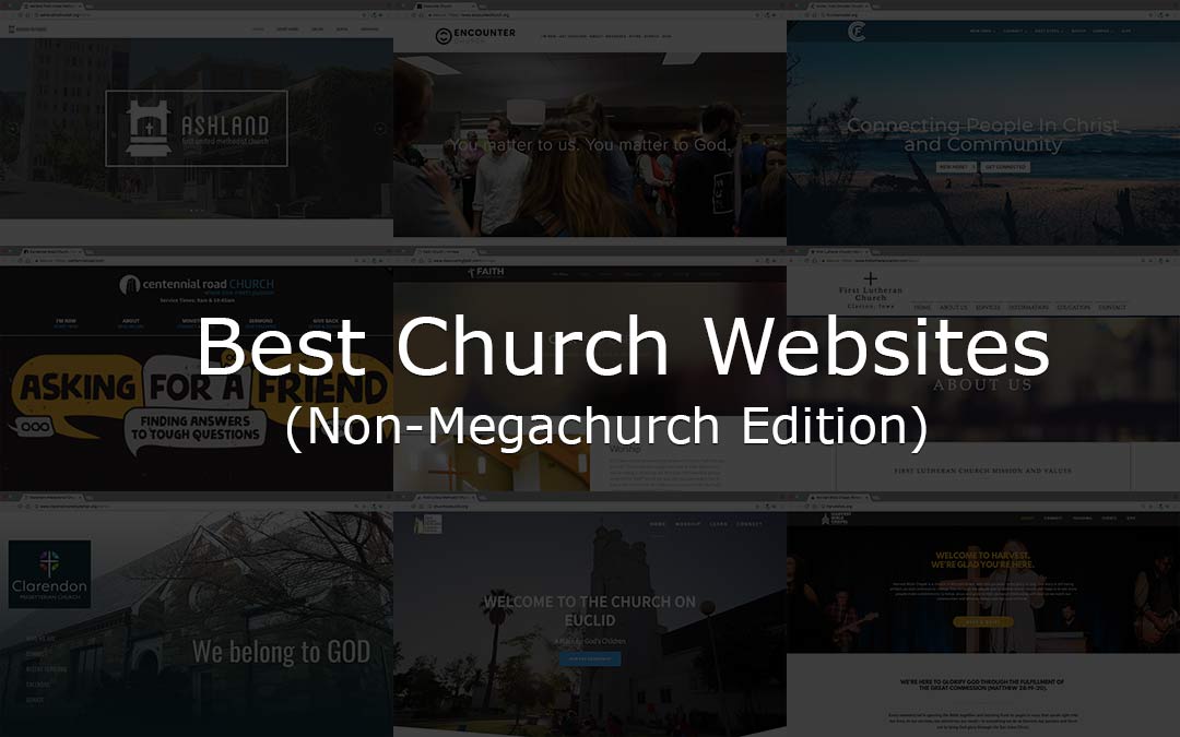
Ever noticed those “best church website” posts feature a whole lot of megachurches? Yeah, that disappoints us too when we look at them, because our own churches are decidedly smaller. Considering that the average church worships 75 people, we wanted to honor normal churches that have exhibited a commitment to a vital web ministry.
Now obviously, we couldn’t review every one of the hundreds of thousands of small church websites out there, but these 18 truly are some stellar ones. We hope they inspire you as you think about upgrading your own church website! Learn more about our methodology and criteria after the rankings, and let us know about others you love. We’ll definitely be adding more to our list.
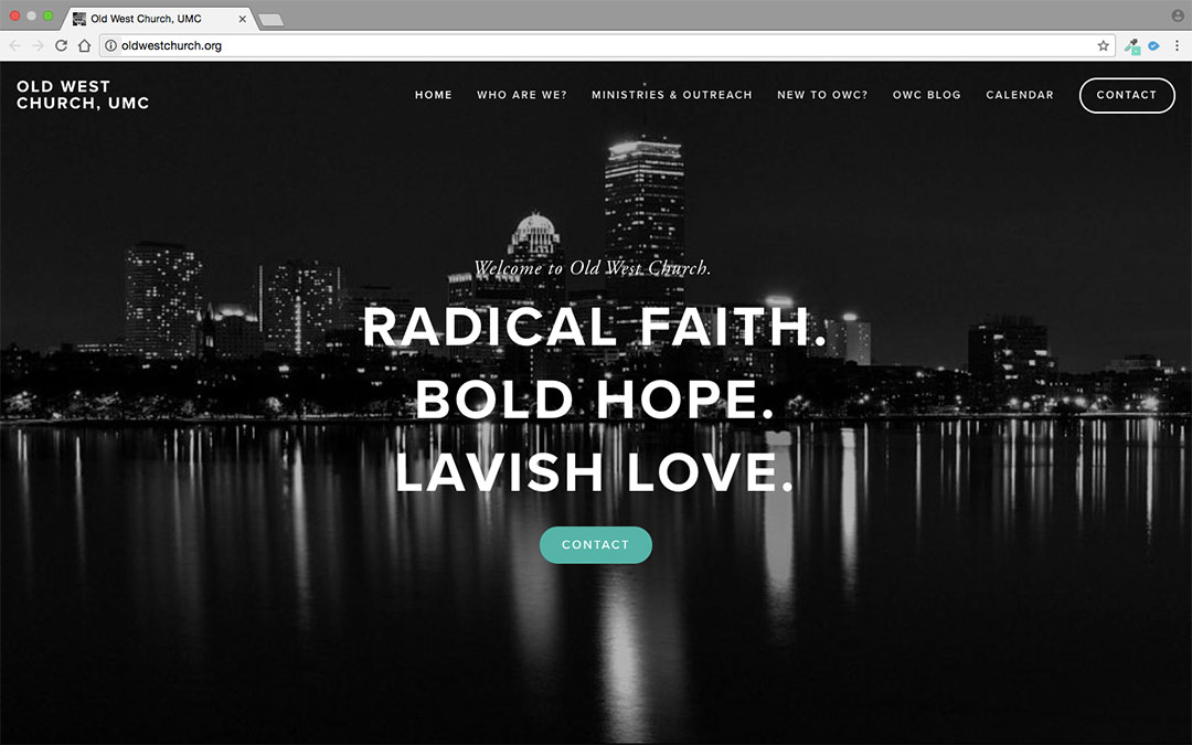
Score: 23/25
Weekly Attendance: 30 people
Tech: Squarespace
Why We Like It:
Located in the heart of Boston, Old West Church celebrates diversity and is committed to proclaiming the word of Jesus through service. This commitment to service is reflected on their website, with the striking city scape really brings their focus to life. All together, Old West Church has a very impressive site, especially considering their average weekly attendance is only 30 people!
Score: 22/25
Weekly Attendance: 25 people
Tech: Hand Coded
Why We Like It:
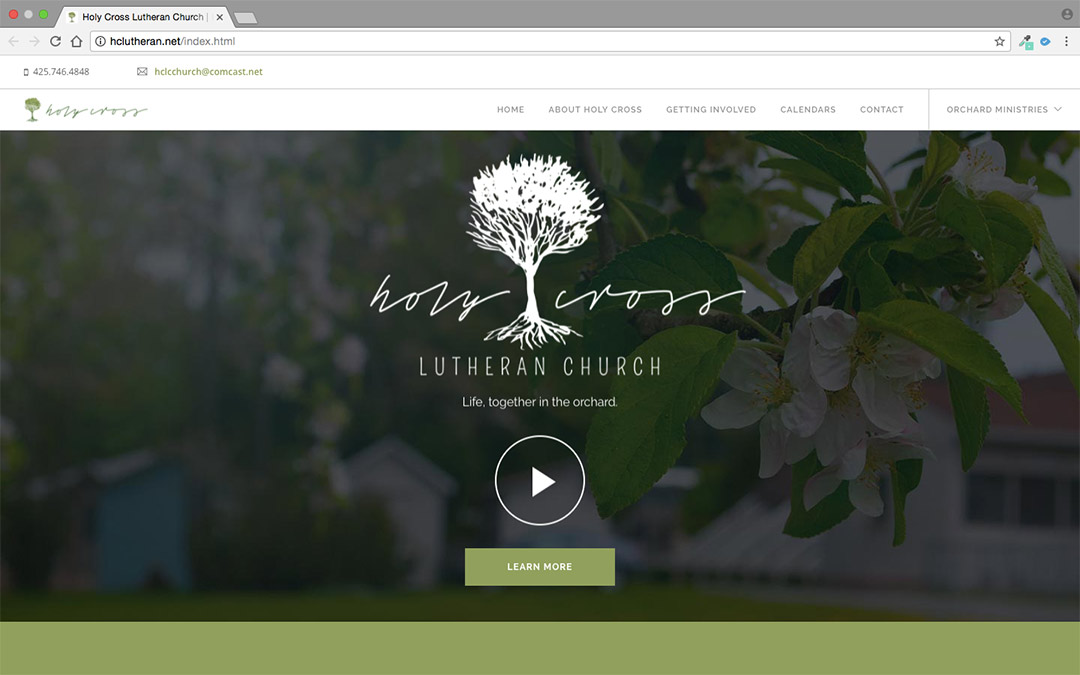
Score: 21.5/25
Weekly Attendance: 65 people
Tech: WordPress, Divi Theme
Why We Like It:
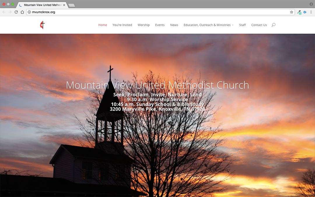
Score: 21/25
Weekly Attendance: 250 people
Tech: Joomla
Why We Like It:
Score: 21/25
Weekly Attendance: 50 people
Tech: Weebly
Why We Like It:
Score: 20.5/25
Weekly Attendance: 55 people
Tech: Cloversites
Why We Like It:
Score: 20.5/25
Weekly Attendance: 45 people
Tech: WordPress, Kause Child Theme
Why We Like It:
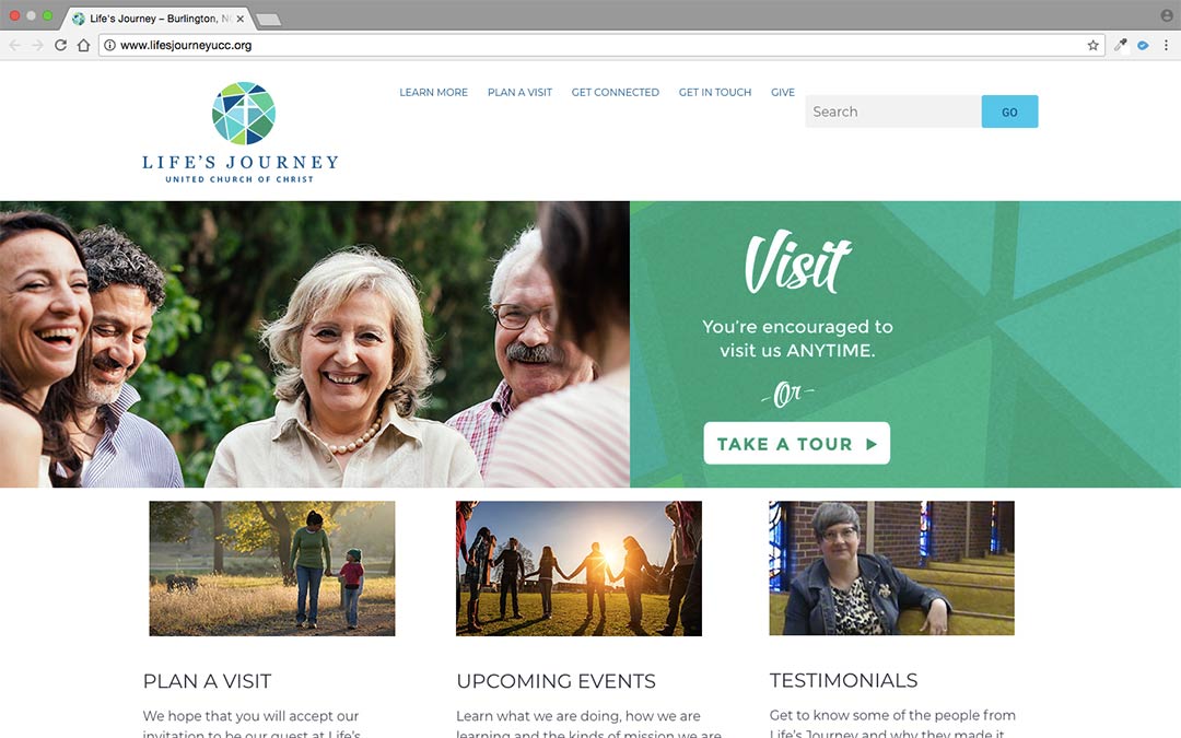
In their own words, Life’s Journey UCC is an “extravagantly welcoming, open and affirming community of faith.” Their site communicates this extravagante welcome clearly. Everything from their hero image with an intergenerational community to their text is welcoming and inviting. We’d love to check them out!
Score: 20/25
Weekly Attendance: 235 people
Tech: WordPress, Unknown Theme
Why We Like It:
Score: 20/25
Weekly Attendance: 55 people
Tech: Weebly
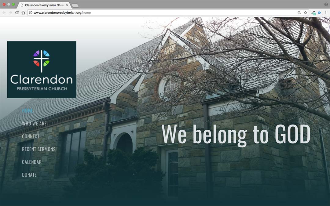
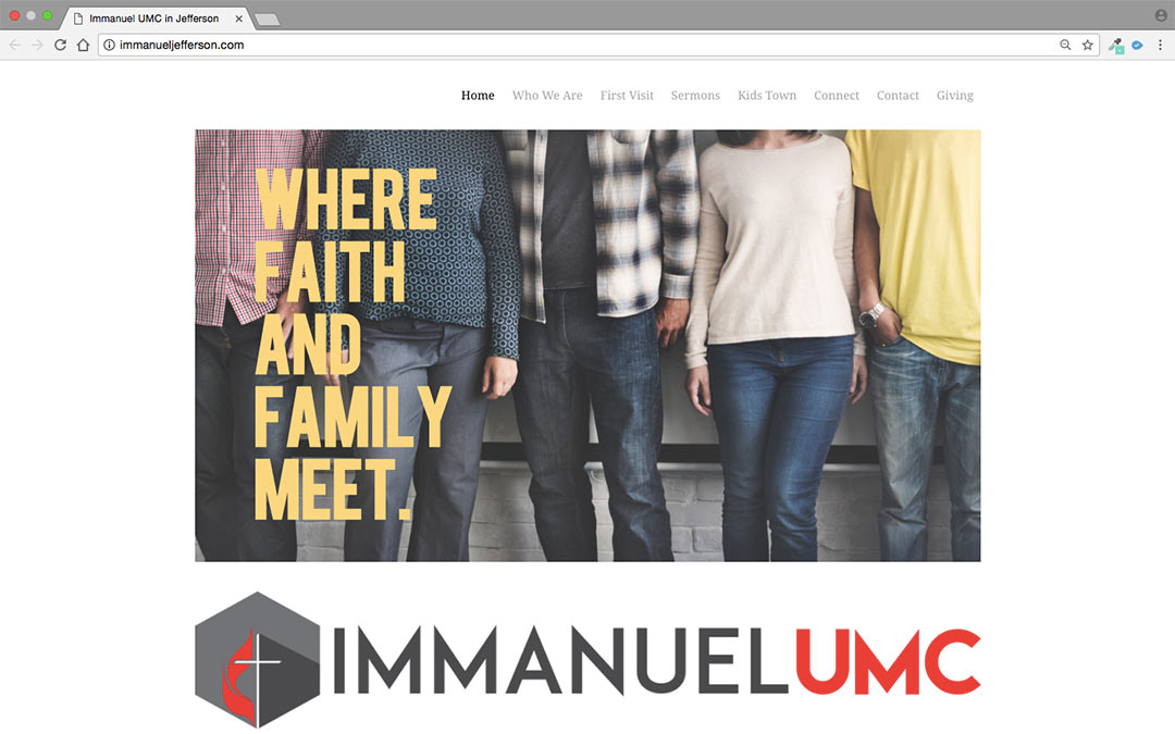
We love the bold condensed type that is repeated in the header images throughout the site. What a great way to add consistency and effective design flair! We also want to call out their awesome use of their website to post sermon videos, which are easily accessible on their sermon page.
Score: 19.5/25
Weekly Attendance: 70 people
Tech: WordPress, One Page Express Theme
Why We Like It:
Score: 19.5/25
Weekly Attendance: 131 people
Tech: DreamWeaver
Why We Like It:
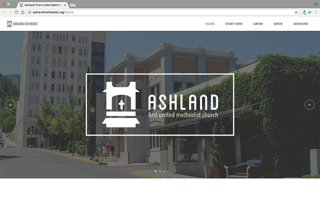
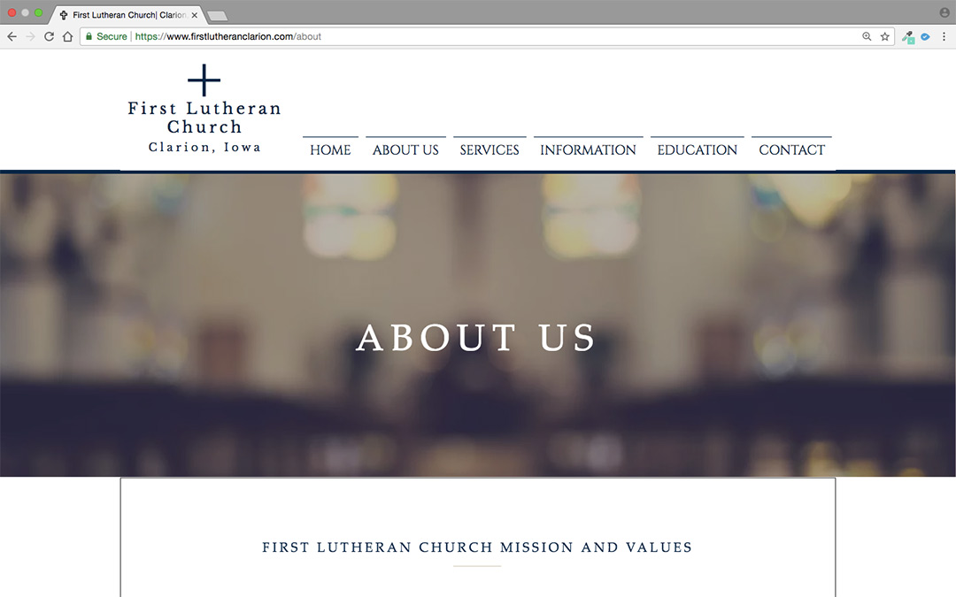
The open, airy, almost effortless feel of this website is what really caught our eye. We love the light color scheme and white background. Ashland First United Methodist Church also makes a great use of their home page with a connection grid partway down. The simple and circular icons and clear text helps users get involved while staying true to the church’s overall brand image.
Score: 19/25
Weekly Attendance: 80 people
Tech: WordPress, Custom Theme
Why We Like It:
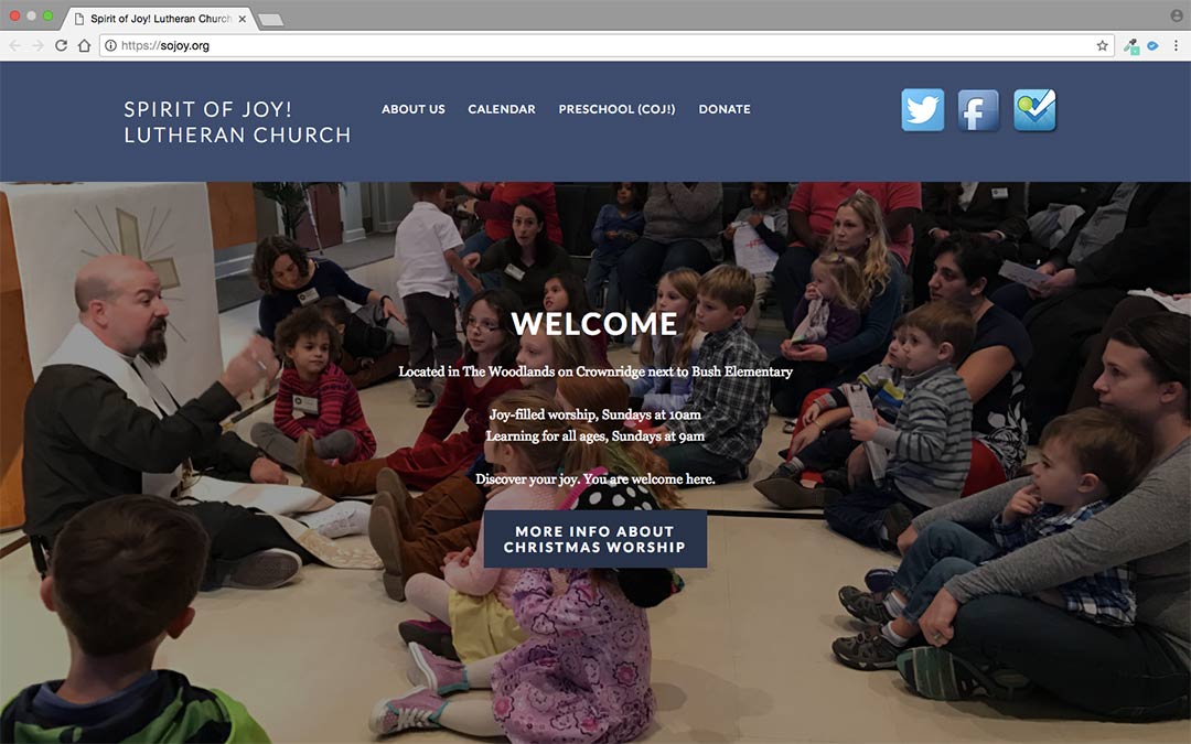
Our favorite element on this site is the Upcoming Events listing that appears throughout the site. It’s clean and readable and matches the website header. Spirit of Joy! includes a great deal of information for new members and visitors. This welcoming gesture really sets them apart from other church sites.
Score: 19/25
Weekly Attendance: 74 people
Tech: Wix
Why We Like It:
Score: 18.5/25
Weekly Attendance: 150 people
Tech: Squarespace
Why We Like It:
Score: 18.5/25
Weekly Attendance: 225 people
Tech: MotoCMS
Why We Like It:
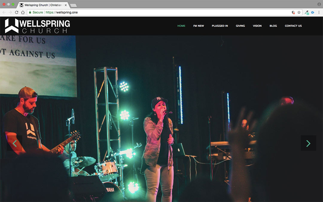
Wellspring makes excellent use of actual photos of their church activities on their site, which really gives visitors a feel for the church. They go beyond inviting and make visitors feel like they already belong. This attitude is repeated on their volunteer page where you can join a team directly from the website, no questions asked.
Score: 18/25
Weekly Attendance: 250 people
Tech: WordPress, Aaron Theme
Why We Like It:
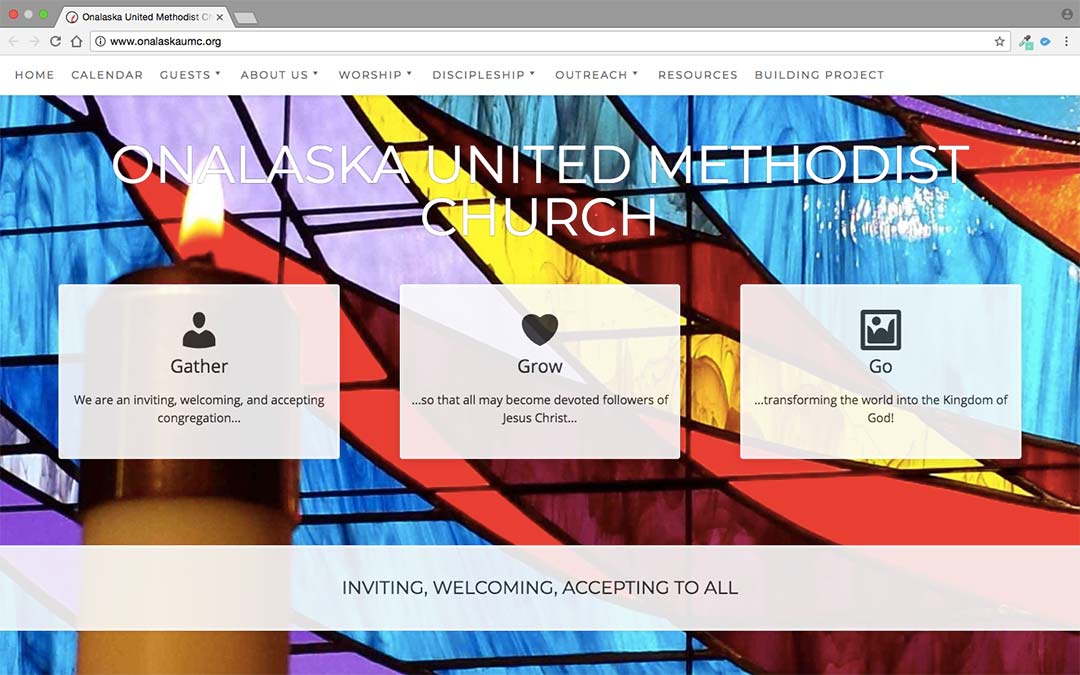
We were excited to see that Onalaska United Methodist Church is using a blog for their announcements. The most recent pages show up on their home page. This is a great and easy way for small churches to keep church members in the loop! They also have exceptional resources for guests, including directions and information about what to expect when they visit.
Score: 17.5/25
Weekly Attendance: 196 people
Tech: WordPress, Divi Theme
Why We Like It:
Score: 17/25
Weekly Attendance: 290 people
Tech: WordPress, Divi Theme
Why We Like It:
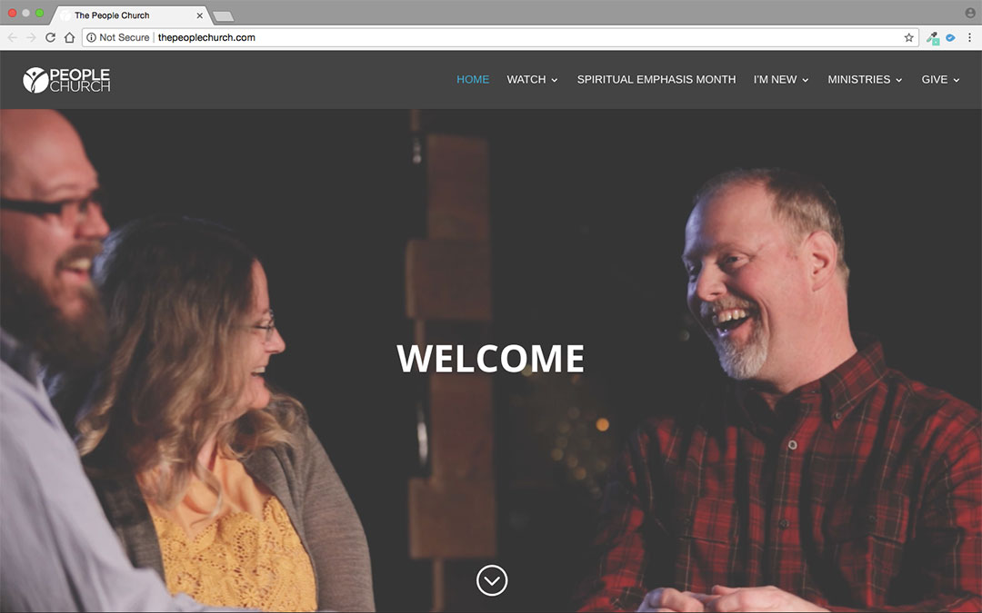
The People Church’s website highlights an active congregation with members who are actively involved with their faith. The video hero images are captivating and show their members in action. Their countdown to worship feature helps raise excitement for their worship service, and their decision to organize giving time and money under the Give link is a creative approach to two connected aspects of Christian life.
Our Methodology and Criteria
Research
We checked out dozens of websites suggested to us on social media, plus dozens more that we found through a popular church website directory. Each site was scored on a spreadsheet using the criteria below. All told, we ranked over 100 sites that seemed promising. Now, on to our criteria…
Church Size
We only considered churches with an average weekly worship attendance under 400, since the United States average is still around 75-80. Smaller churches often have to sacrifice to prioritize their web ministry and should be commended. The smaller the church, the higher they ranked.
Design
We looked for sites that were laid out in a manner that’s easy to digest, with consistent fonts, colors, and other brand elements. In addition, we confirmed they looked good on various screen types and were esthetically pleasing.
Welcome
Here we considered how welcoming the site is to guests. We looked for an obvious invitation into the life of the church, friendly language with a lack of jargon, and warm, inviting media.
Discipleship
Next, we looked for sites that encourage users to deepen their relationship with Christ through participation in the life of the church. Important factors included having an engaging description of ministries, sign-up forms, and an active church calendar.
Local SEO
We used the MOZ Local (https://moz.com/local/search) search tool to rate the strength of each church’s local findability. This includes having good location indicators on the website as well as being cross-referenced on social media and online directories. For more information about how to improve this score, check out our post How to Get Found on Google.
No Aboundant Sites
There are some amazing church websites on our Aboundant network that would rank highly, but we wanted to maintain impartiality in our rankings. So, we excluded these sites from the start.
Recommend a Small Church Website
We’ll be keeping an eye out for many more small church websites that are amazing so we can keep our list updated and growing. If you know of one we should check out, tell us about it.
Oops! We could not locate your form.
Make Your Own Amazing Church Website
Making a beautiful, full-featured church website is incredibly easy using Launch Pad, our quick-start system that gets you going in as little as 10 minutes. Don’t believe us? Why not give it a no-commitment try yourself! Here’s a start-to-finish look at what happens when you go through Launch Pad.
0 Comments
Trackbacks/Pingbacks