
Ready to build a new church site?
These 20 stellar small church websites are worth studying before you begin.
An incredible church website is pretty easy to have if your church staff is large enough to support someone with those gifts and talents. Small churches, though, frequently don’t have as many financial or people resources available to them. That’s one of the reasons we always get excited by smaller churches that have terrific websites. We thought you should see some of them too!
So, here’s what we did. We asked friends, colleagues, our site visitors, and various facebook groups for recommendations of stellar small church websites (with “small” in this case meaning an average weekly worship size of 400 or fewer.) Submissions came in from all over the world. We looked carefully at well over 130 of them, ranking each one based on 6 categories of website effectiveness: church size, design, welcome, discipleship features, local SEO, and speed. (You can learn more about our methodology and criteria after the rankings.)
The 20 church websites below show incredible commitment to their web presence and ministry. We hope that the unique features in them will inspire you with some great ideas for your own church site! Be sure to click the photos to visit each site. Many of these church websites may look different by the time you visit them. Actually, we hope they do!
By the way, while the sites below are awesome, there really isn’t such a thing as “The Best Church Website,” and we can’t possibly visit every one of the hundreds of thousands of possibilities. So, tell us about a site you love that we missed using the form at the bottom. We will be sure to look at them for future updates or articles. You’ll also find a discount code so you can build a site like any of these on Aboundant!
Score: 25/30
Weekly Attendance: 100 people
Tech: Self-Coded
Why We Like It:

Score: 24.5/30
Weekly Attendance: 160 people
Tech: WordPress
Why We Like It:

Score: 24/30
Weekly Attendance: 45 people
Tech: Squarespace
Why We Like It:
Score: 23.5/30
Weekly Attendance: 60 people
Tech: Squarespace
Why We Like It:

Score: 23/30
Weekly Attendance: 240
Tech: WordPress
Why We Like It:

Score: 23/30
Weekly Attendance: 100 people
Tech: Squarespace
Why We Like It:

Score: 23/30
Weekly Attendance: 30 people
Tech: WordPress
Why We Like It:

Score: 22.5/30
Weekly Attendance: 220 people
Tech: WordPress
Why We Like It:
Score: 22.5/30
Weekly Attendance: 90 people
Tech: FaithConnector
Why We Like It:

Score: 22/30
Weekly Attendance: 150 people
Tech: WordPress
Why We Like It:
Score: 22/30
Weekly Attendance: 190 people
Tech: WordPress
Why We Like It:
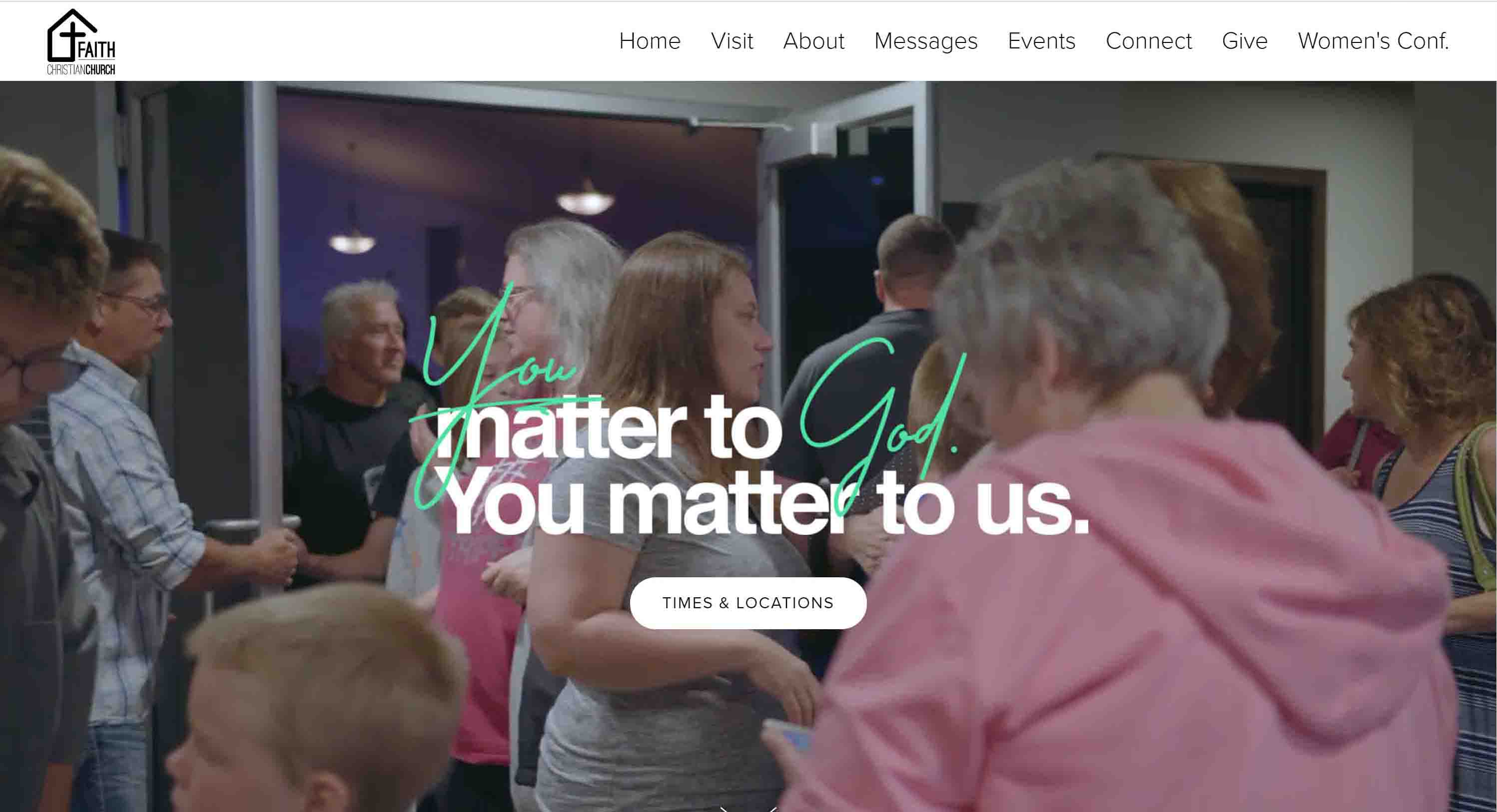
Consistent branding and the immediate call to action for guests is what makes this site really stand out. Their homepage is packed with easy ways to get involved and learn more. Additionally, they have done an excellent job using in-house photography to provide a window into their worship and fellowship times. Pay close attention when you visit to their simple web copy, which makes quick reading a snap.

Score: 22/30
Weekly Attendance: 160 people
Tech: ShareFaith (WordPress)
Why We Like It:

Score: 21.5/30
Weekly Attendance: <150 People
Tech: WordPress
Why We Like It:
Score: 21.5/30
Weekly Attendance: 185
Tech: WordPress
Why We Like It:
14. Village Church | Sydney, Australia
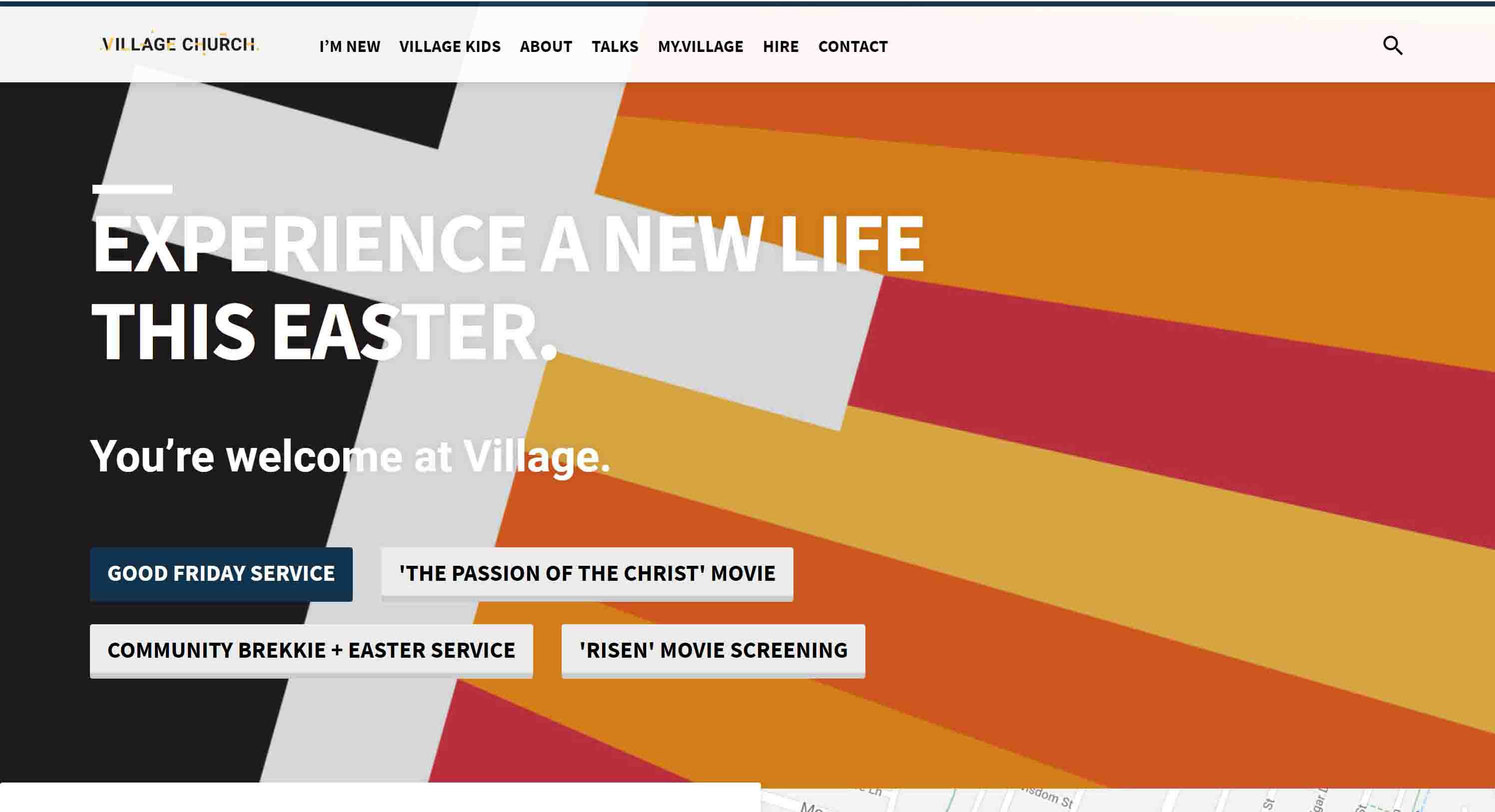
Score: 21.5/30
Weekly Attendance: 160
Tech: WordPress
Why We Like It:
We were excited to see the variety of guest-friendly resource groups that Village Church facilitates within its community. Their homepage features groups such as a playgroup, divorce care group, and an Wednesday after school program. Giving these groups a prominent place communicates that the church cares about people regardless of where they are in life. Their site is welcoming and laid out well, using bright colors and internally-sourced photos to draw visitors in.

Score: 21.5/30
Weekly Attendance: 100 people
Tech: Wix
Why We Like It:

Score: 21.5/30
Weekly Attendance: <100 people
Tech: Weebly
Why We Like It:
River Market Community Church features high quality, internally-sourced images of their community in worship and fellowship. Their site puts their white background to good use, making the whole site feel airy, open, and inviting.
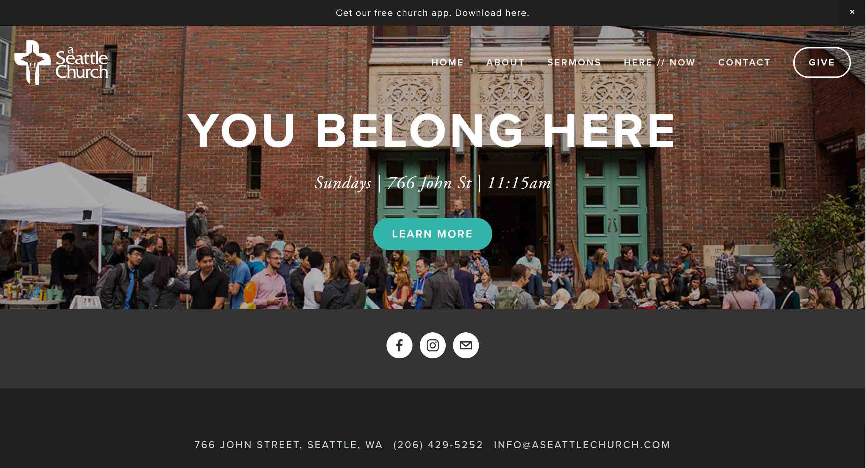
Score: 21/30
Weekly Attendance: 100 people
Tech: Squarespace
Why We Like It:
They had us at the logo: the Seattle Space Needle is cleverly nested inside the cross. By taking a landmark building and combining it with a classic Christian symbol, they integrated a sense of traditionalism with contemporary Christianity. Additionally, their site is clean and easy to navigate. The hard edges and flat design elements really make their content pop.
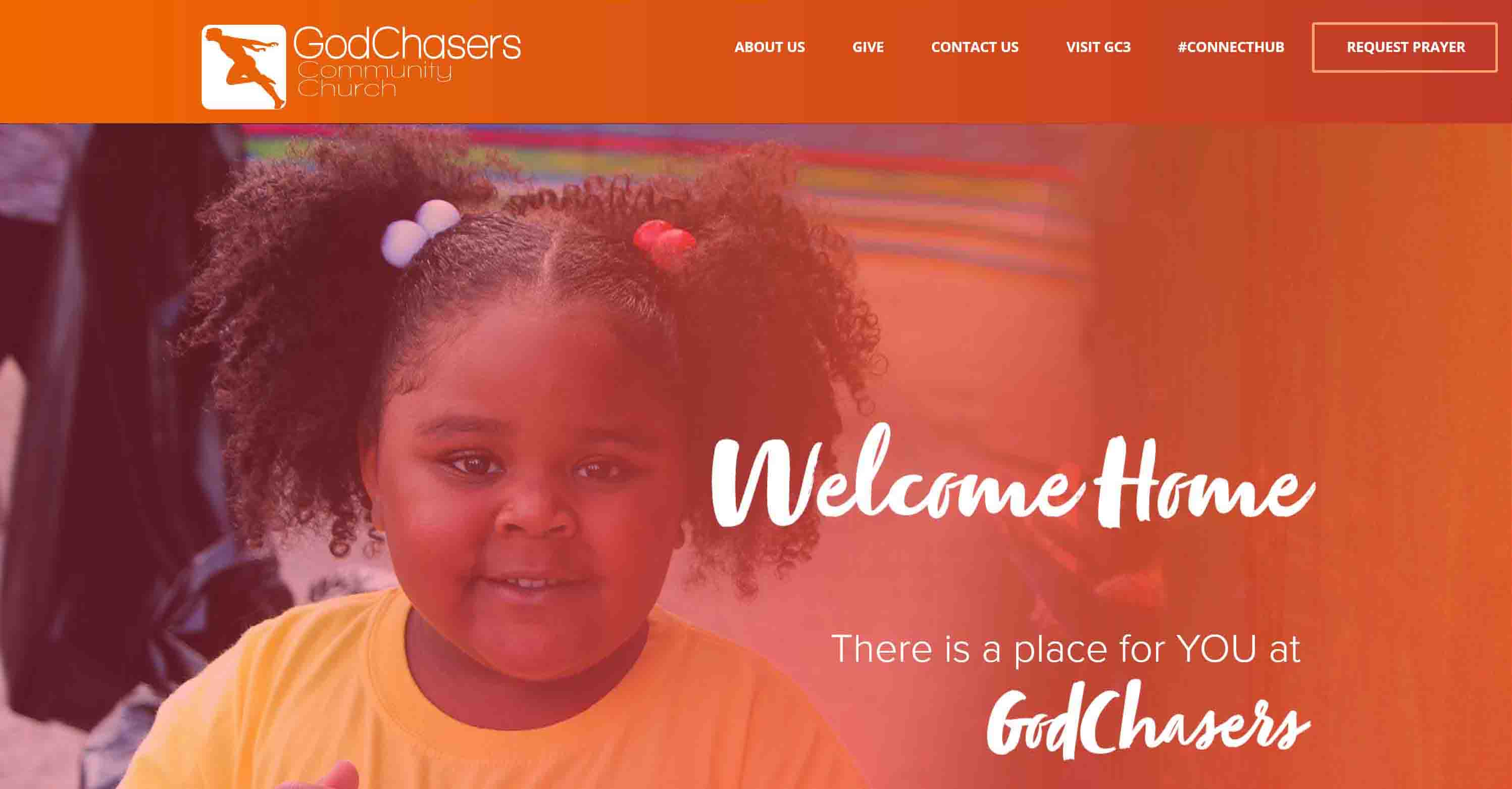
Score: 20.5/30
Weekly Attendance: 190 people
Tech: Muse
Why We Like It:
One word: bold. From the bright orange branding to the large scripted fonts, this site stands out. As you move down the homepage, patterns and bright colored gradients are integrated into all of the design elements. Even the photographs of the pastors have bright colors in background. The name “God Chasers” sets an active precedent, and their lively website lives up to it.
Score: 20.5/30
Weekly Attendance: 350
Tech: Squarespace
Why We Like It:
20. Tree of Life Lutheran | Minneapolis, Minnesota
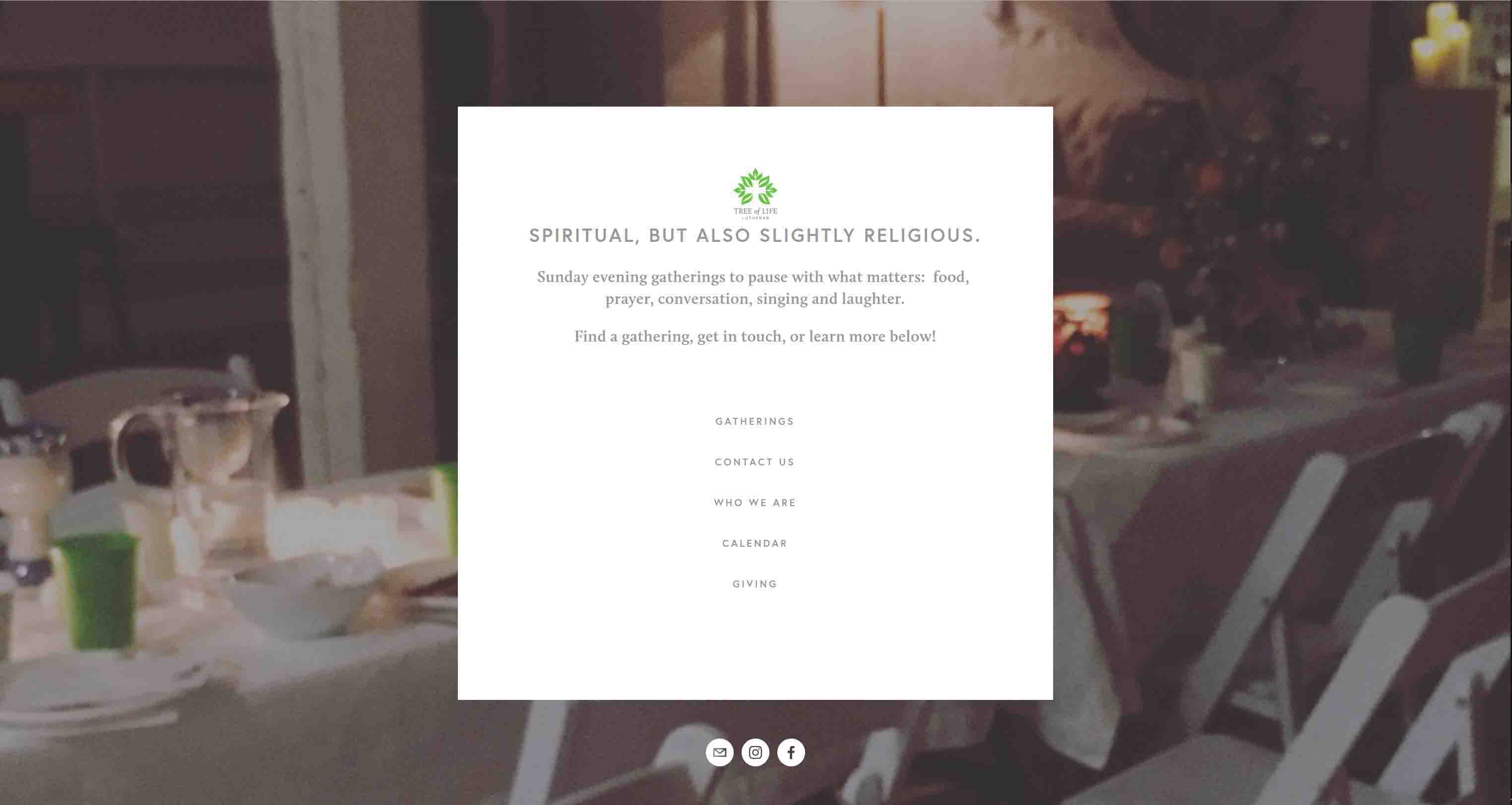
Score: 20/30
Weekly Attendance: <80 people
Tech: Squarespace
Why We Like It:
Runners Up: 10 More Bonus Sites
Still want more? Here's our list of the Best Church Websites for 2018.
Want a Church Site Like One of These?
You can build it on Aboundant!
Every one of these sites could be built on our powerful platform. Because of its flexible, powerful, modular design, our theme – Divi – can be used to create almost any site you can dream up. Here’s more info…
Our Methodology and Criteria
Our Research Process
We checked out dozens of websites suggested to us via email, on our website, or on social media. Each site was scored on a spreadsheet using the criteria below. We gave them a ranking from 1 to 5 for each criteria, then totaled up the scores (with 30 being the maximum possible). All together, we ranked well over 100 sites that seemed promising. Now, on to our criteria…
1. Church Size
We only considered churches with an average weekly worship attendance under 400, since the United States average is still around 75-80. Smaller churches often have to sacrifice to prioritize their web ministry and should be commended. The smaller the church, the higher they ranked. Remarkably, only 2 churches with an average over 200 made the final cut!
2. Design
We looked for sites that were laid out in a manner that is easy to digest, with consistent fonts, colors, and other brand elements. In addition, we confirmed they looked good on various screen types (i.e. had responsive design) and were aesthetically pleasing.
3. Welcome
Here we considered how welcoming each site is to guests. We looked for an obvious invitation into the life of the church, friendly language with a lack of jargon, and warm, inviting media.
4. Discipleship
Next, we looked for sites that encourage users to deepen their relationship with Christ through participation in the life of the church. Important factors included having an engaging description of ministries, sign-up forms, a clear way of connecting with guests, and an active church calendar.
5. Local SEO and Global SEO
Without a doubt, this was the toughest criteria to rank well in, and almost no church scored perfectly. We used the MOZ Local (https://moz.com/local/search) search tool and GeoRanker (https://seoapp.georanker.com/) to rate the strength of each church’s local local findability. Then we checked their global score using SEO Analyzer (https://neilpatel.com/seo-analyzer/). The final SEO score was an average of the local and global scores. This includes having good location indicators on the website as well as being cross-referenced on social media and online directories. For more information about how to improve this score, check out our post How to Get Found on Google.
6. Speed
We used Pingdom tools (https://tools.pingdom.com/) to calculate the average loading speed of each church’s site. The tool calculates load time, page size and number of requests.
No Aboundant Sites
There are some wonderful church websites on our Aboundant network that would rank highly, but we wanted to maintain impartiality in our rankings. So, we excluded these sites from the start.
Recommend a Small Church Website
We’ll be keeping an eye out for many more small church websites that are amazing. So that we can keep our list updated and growing. tell us about a site you think we really should check out.
Make Your Own Amazing Church Website
At Aboundant, we believe you deserve choices when it comes to your church website.
Like to Do It Yourself?
Our theme, Divi, has dozens of fully-customizable layouts that will make things easy to get going quickly. You can also build your site from scratch using the many drag-and-drop modules. We even have an exclusive, premium theme created for United Methodist churches. Contact Us if you want one of these approaches set up for you to try out for a month.
Need a little more help getting started?
Making a beautiful, full-featured church website is incredibly easy using Launch Pad, our quick-start system that gets you going in as little as 10 minutes. Click here to start your 30 day trial.
Ready for a custom site?
If you’re serious about your digital ministry and your online presence, maybe it’s time for you to significatly upgrade your website. Let’s chat about your needs and dreams.
Want a discount? For a limited time, you can get 15% off the first year of our annual plans when you use our discount code: Thrivein2019 (Thrive) or Transformin2019 (Transform).