After building and consulting on dozens of church websites, and reviewing hundreds more, I can tell you with certainty that there is no magic formula for how to structure your church website. Instead, it becomes a moving target in the face of rapid technological change. This is why you should consider revamping your church website to be a continual process. Having said that, there are still some components you would expect to find in a church website. Articles like this tend to focus on a one-sized fits all approach. Others will give you different layouts based on size. I’m to buck the trend by giving you layouts based on technical literacy, which often (though certainly not always) mirrors church size.
The Low-Tech Church Website
This low-tech site is predominated by mostly “static” content, which means there won’t be a need for regular updates or using more complex software. Here’s a breakdown of the elements:’
 About Page(s)
- Welcome Statement
- Vision/Beliefs
- History
- Staff
- Ministry Pages(s)
- Be sure to avoid insider language and to lead with ministries that are visitor friendly. Also list how to get involved and who to contact for more information.
- Contact Page
- Map
- Directions
- Contact Information
- Contact Form
- Parking Information (if necessary)
- Welcome Statement (New?)
- Statement of Welcome from the Pastor
- What to expect when worshiping
- Childcare Options
- Visitor Friendly Ministries
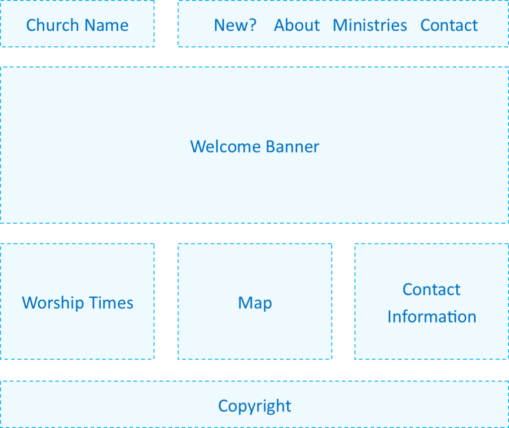
- Welcome Banner
- This is often a picture of the church or sanctuary with a message like “Welcome to <Church Name>.” Also consider using a picture of diverse smiling faces from within the congregation.
- Worship Times
- Map
- If your website system doesn’t have a calendar feature, embed a google map.
- Contact Information
- Copyright
- This is typically “Copyright © <Church Name> <Year>, All Rights Reserved”
Most of this information can be handled by a facebook page, which makes facebook a viable alternative for small churches.
The Moderate-Tech Church Website
The hallmark of the moderate tech church website is some interactive features that are hard to setup, but easy to maintain after the fact. Here are the added features:
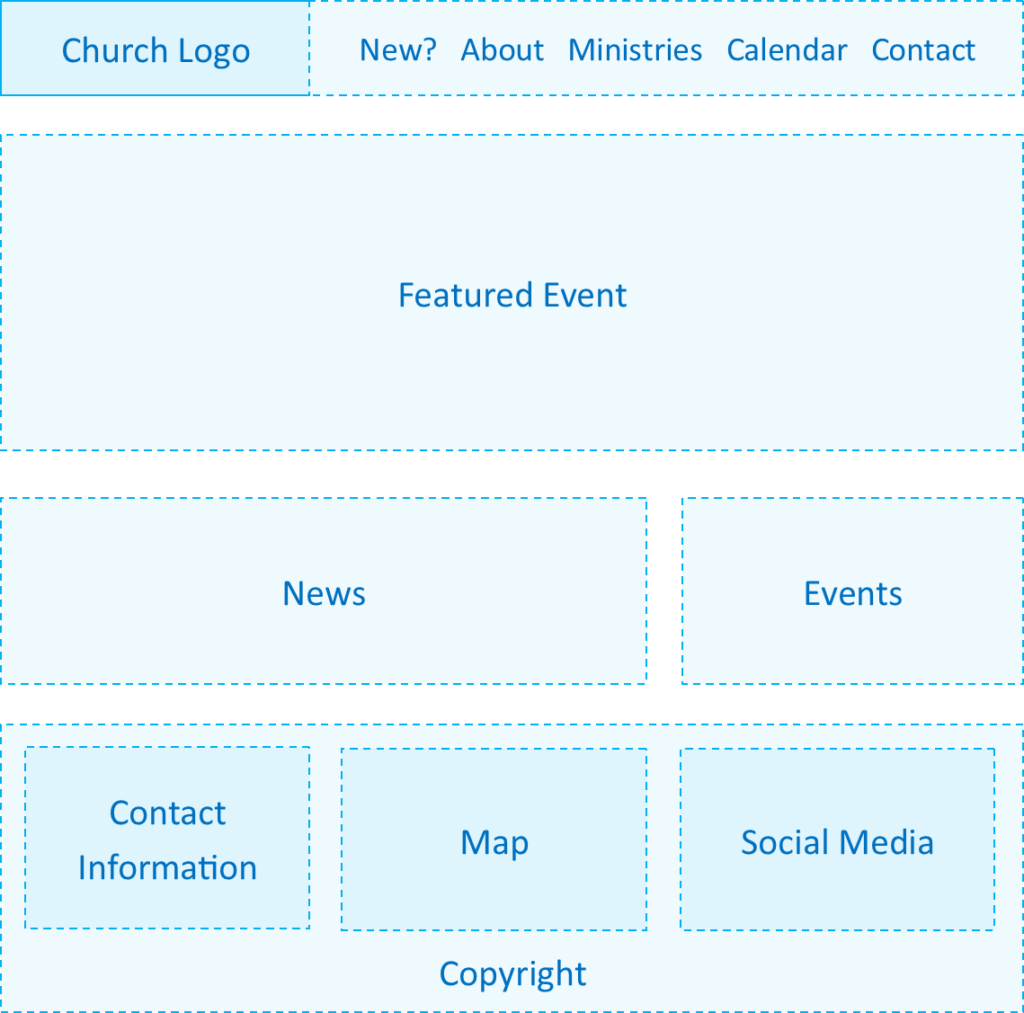
 Church Logo
- This is where your custom church logo or denominational logo will go.
- Church Calendar
- If your website system doesn’t have a built-in calendar, then consider embedding a google calendar.
- News Feed
- This is where you can post timely information about your church. Most website “Content Management Systems” like WordPress have a convenient method for managing these posts.
- Events Feed
- The is a list of the next few events on your calendar. Use the “list view” version of your calendar system to insert it.
- Social Media
- Social Media Links
- Follow Buttons
- Feeds
With this level of technology it is important that multiple stakeholders receive training on how to use the site. This will allow for institutional memory in keeping the site up to date.
The High-Tech Church Website
The High-Tech church website is all about the different types of media on the front end, and the user features on the back end. Here the added elements:
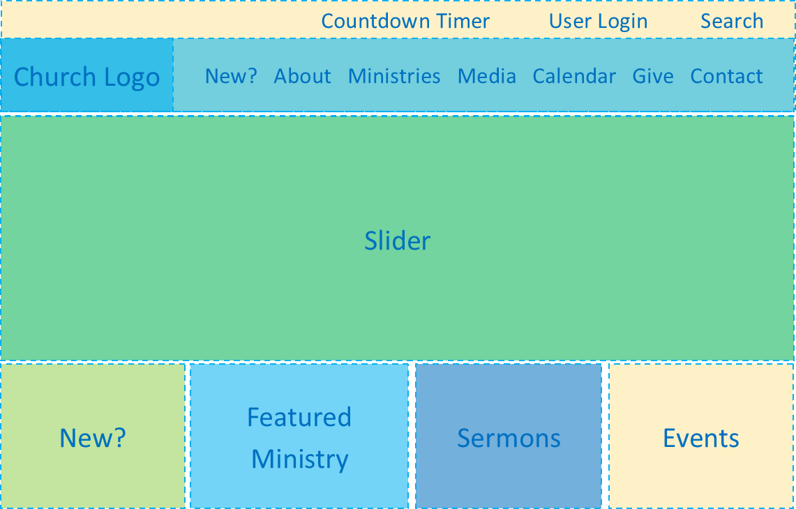
 Countdown Timer
- These are great for churches that have non-traditional worship times.
- User Area (Password Protected)
- Church Directory
- Small Group Management
- Giving Management
- Volunteer Management
- Image Gallery
- Media Page(s)
- Sermons
- Text
- Audio
- Video
- Blog
- News
- Sermons
- Giving Page
- This is where people can give to the church or even better, give to specific causes. PayPal is one of the easiest and most affordable systems to use for this functionality. If you are a 501(c)(3) then you can apply for PayPal Donations and get even lower rates.
- Slider
- A slider is a space where you have more than one image that rotates every few seconds. These are useful for when you have multiple important events going on around the same time. Each slide can link to a post about the event.
- Featured Ministry Banners
- These are smaller banners that link to your most visitor-friendly ministries.
- Media Area
- This displays a few posts for each type of media.
- Quick Links
- When your site has a lot of pages, it’s nice to give insiders their own shortcut to important pages.
Even if you are a small- or medium-sized church, if you are technologically literate you will be able to build a website that greatly empowers discipleship.
NOTE: There is a size of church to consider that’s not represented above, and that is the Multiple Campus Church. However, I assumed that churches of that size will have the technical capabilities to determine how to best structure their own websites.

 About Page(s)
 Church Logo
 Countdown Timer