Make Your Blog as Great as Zapier’s
Every year or so, I get the itch to change email clients. This seems to coincide with either a version upgrade, an operating system change, or the purchase of a different computer. When the itch arrives, as it did a few days ago, I go looking for recent reviews of the many different email apps on the market. (Stay with me…I promise this will relate to your church blog soon!)
The reviews of email clients I checked out first provided very little in the way of helpful information about the features, simply laying out a list of some of the “top” email clients and a few of their key features. After a few missteps, I found this terrific, incredibly thorough post about numerous email apps. I encourage you to open it now and scan it briefly, then save it for digesting later.
Reviews like Zapier’s clearly take a lot of time to research and write. Zapier is a company that can afford to take on such tasks, but these posts aren’t written just because their employees are sitting around with time to kill. They do this type of “content marketing” because it a) establishes their expertise and b) drives sales.
So what does a blog post about email apps have to do with the blog on your church website? I’d argue that by studying blogs carefully you can learn a tremendous amount of information useful for setting up your church blog and turning it into an effective ministry tool. Let’s walk through Zapier’s post together as an example of how to do this yourself. As you read, take note of any elements you need to change in your own church blog.
Subscription Form
Zapier understands that the attention span of readers is short, and that some people prefer to get posts in their inbox. So, this handy, simple form is literally top and center. You know exactly what you’ll be receiving, and you don’t have to provide any personal information beyond your email address. I’d bet this form “converts” highly; in other words, I suspect a large percentage of page readers subscribe.
Does your blog have a clear, simple subscription form? Have you made it clear what subscribers will receive and how they will benefit from getting it? Do you ask for too much personal information?
There are many ways to put subscription forms on your blog. A good way to start is to use whatever tools are provided by the email newsletter service your church uses, such as MailChimp (our personal favorite) or Constant Contact. There are also various website tools and plugins that can do the job nicely, such as Bloom or SumoMe.
Featured Image
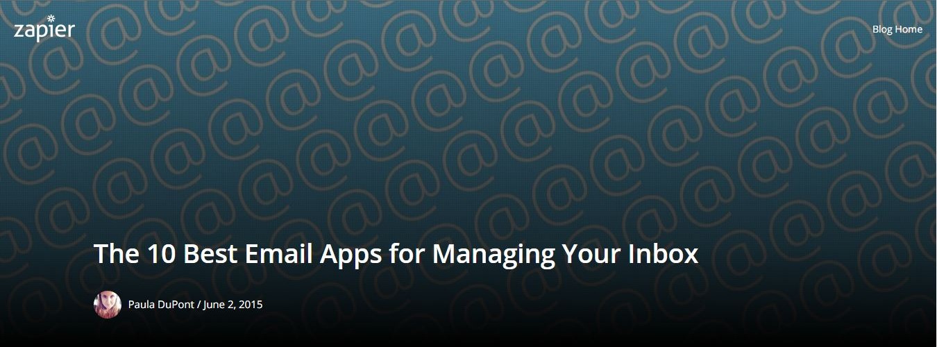
The featured image, as it’s known in WordPress at least, is the blog image at the top of a post. In the image above, Zapier gets several things right.
- The company logo is included. This is a nice way of communicating a brand and making sure that any shared images get the company name in front of readers.
- The image itself is simple, and it gets at the iconic element of an email address, the @ sign.
- The title is perfect. It tells the reader exactly what to expect, and it’s search-engine friendly. Incidentally, titles with “you” or “your” have a higher likelihood of being clicked than titles that are more straightforward in tone. Readers want to know how they will benefit from reading an article; they are less interested in something that just seems informational.
- The typeface is clear, large, and stands out well.
- The author’s image and name connect the post to a real author. It’s not an article written by a robot.
- The design is responsive, meaning that it adjusts according to the browser size. You can test this yourself: just resize (shrink) your browser window from right to left, and watch how the layout and text changes.
Many blogging and social media experts will tell you that you should spend almost as much time perfecting your featured image as you do the post itself. That’s probably a bit extreme, but it is clear that strong imagery is vital if you want to get your posts read by your existing–and more importantly, your potential–audience. Look at your church blog now. Does the imagery communicate anything important and positive about your church, your content, and your author?
The Beginning of the Content
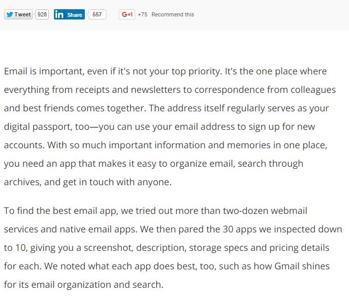
The opening paragraph of your blog is important. In fact, the only thing more important is the title. The first few words of the first paragraph are frequently what get picked up when an article is shared in social media or in a mass email, so make sure the first sentences are short and interesting.
Note too that the opening of the article is just three short paragraphs (seven total sentences) in length. That’s plenty of space to introduce a longer article. Shorter articles will of course need even shorter opening paragraphs.
Using Sections in Your Posts
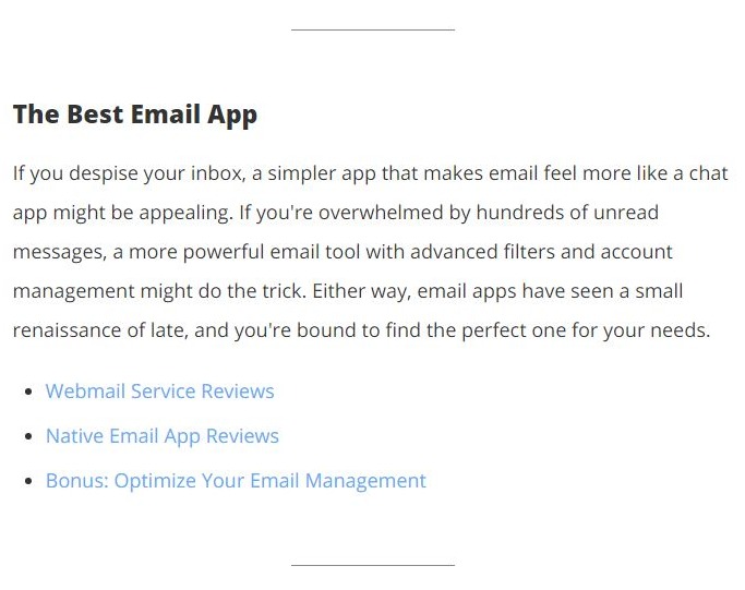
Above you can see three effective aspects to creating an effective section.
- The divider lines make it clear when a section has started and stopped. They make it easier for the eye to scan an article.
- The short size of the section is perfect for reading on a small screen, such as a phone. It will fit entirely on one screen.
- The links go to the various sections of the post, making it easy for a reader to navigate the content. Those links also help search engines know how to organize the page’s content, by the way, which help’s the page’s search engine optimization.
Think now about longer posts that your church might make, such as a featured article about a major new church program (stewardship campaign, new small group ministry, etc.) or the text of a pastor’s sermon. How can you break up your posts into sections? Could you have headings and sub-headings? Could certain quotes be highlighted (in what is known as a pull quote) so that they break up the text and become Tweet-worthy?
Use Charts to Present Complex Information
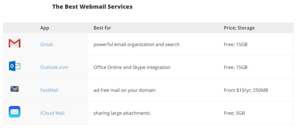
Each section in the article contains a chart like the one above. These give the app’s icon, name (with link), who the author believes would appreciate the app, and the two most essential pieces of data about the app. Color is used to separate columns in an effective way.Charts can sometimes be hard to create and use on websites. Their width does not always work well on mobile devices. For this reason, three to four columns is often all you will want to put in your charts. Be sure to test them on mobile devices (or at least by shrinking the browser window) before you publish them.
What charts could go in your church’s posts? Here are some examples.
- Sunday School lists (icon, class name, age group or topic, room #)
- Small group information (group name, leader with email link, group purpose, location and date/time)
- Church leadership (small photo, leader’s name, team or committee name, contact link and phone #)
- Calendars (event, start time, end time, room)
- Volunteer opportunities (volunteer need, brief description, time requirement, team leader)
- Recommended resources (Book or website title, age group, library call number or link, brief description)
The Primary Content
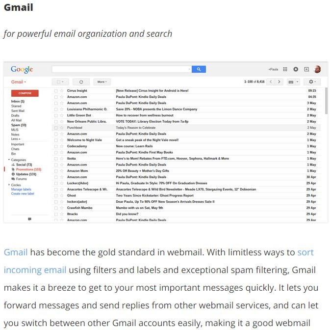
Each of Zapier’s reviews contain a screenshot, a link to the app, a link to see special features or related posts, and a description of the essential features. The reviews are not comprehensive, but they provide enough information for the reader to know if that app is worth checking out further. Whitespace is used effectively to make the text easily readable and between text and images. The paragraphs are fairly short, which is ideal for websites in general.
Every page and post on your church website likewise needs to contain both images and text. It should link to related articles within your website, when possible. The copy should be easy to digest, with sentences that won’t confuse someone who is reading quickly. It should be instructive and avoid long words.
Repeat and Reuse Key Information
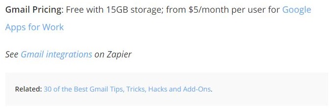
At the end of each app description, the user is reminded of the two things they’ll typically care about most: the price, and which email hosts and types (e.g. Gmail, IMAP, Yahoo) the app will work with. Plus, links to related articles are suggested for the reader who wants to dig deeper.How often in your own blog posts do you restate key information? Have you thought about what your readers most need to know or remember, and can you summarize that at the end of the post? Most likely, your website contains other relevant posts, pages, calendar entries, or other items that relate to the particular content.
Here’s a tip: if you regularly use the tagging feature in your website, those tags should lead readers to other relevant posts. Of course, some may be dated due to the time-sensitive nature of many church posts, so be sure to read potentially relevant posts before you link to them.)
Give Yourself a Plug
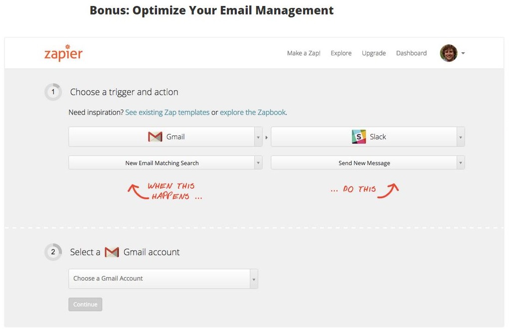
After all of the information about the posts, Zapier finally gets around to promoting itself. Given the fact that the topic at hand is email clients, it certainly makes sense for them to highlight their own features that enhance some of these apps. However, Zapier doesn’t toot its own horn until after it provides a ton of terrific content.
Now, here’s where things start to get very interesting when it comes to church posts, I think. This is where your blog can really be a powerful tool.
Most churches use their blog as a way to tell church insiders about insider information. The blog becomes a glorified version of the church’s print publications, where the posts largely duplicate items in the bulletin or newsletter. Other items that church members want or would find useful, such as sermon podcasts, registration forms, or reflections from the pastor, are the most commonly posted items. And of course, there’s nothing wrong with that.
However, imagine what could happen if you created some really wonderful posts that would be useful to your community, such as a post about all of the resources in your community that serve the homeless. Then, at the end of that, you could highlight how your church is involved with those or other ministries.
Or, what if you created a weekly family activity guide that had suggested community activities, fun and creative food ideas, games to try, and so on? Again, you could highlight in subtle ways some of the great opportunities at your own church. Writing posts like these could be a powerful ministry for some creative teachers or parents!
Or, imagine you were to create a place where members of your congregation could submit book review of great books they are reading. (A member of my congregation has a passion for this ministry.) Those book reviews might have brief mentions here and there of the spiritual themes or lessons in them, or they might include information about a book group at the church where the book will be discussed.
Hopefully, you’re beginning to get the idea: your posts don’t have to be all about your church. They can be used as a way for people in your community to get information of interest to them, to connect individuals to great opportunities for service, to strengthen family ties, to talk up businesses in the community, and so on. All of that builds trust and respect for your church, making it more likely that visitors will find and consider you worthy of a visit.
Send Readers Elsewhere…and Recognize Your Authors
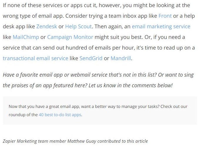
Sometimes, an app is just not a great fit for everyone. Most businesses wouldn’t admit that very loudly. In a blog post, though, a writer can be free to say, “Hey, here are ten apps I loved, but here are ten others to check out too.” This is a more honest way to write, and it proves you really have done your homework.
Your church doesn’t have every kind of ministry under the sun, and that’s OK. You’re not called to do everything but to do some things really well. So, link to the ministries of some other congregations nearby who have something great to offer. Chances are, there are people in your congregation who are already involved in ministries elsewhere. When you are unafraid to send your congregation members somewhere else, you communicate to them that you value their needs and want to be a great partner with other local congregations. That type of openness can really break down barriers in your community over time.
The Zapier post had more than one contributor, and the author acknowledged that. Similarly, your posts may have multiple contributors from time to time, including help from community members. Be sure to note them when that’s applicable.
Open Things Up Through Comments
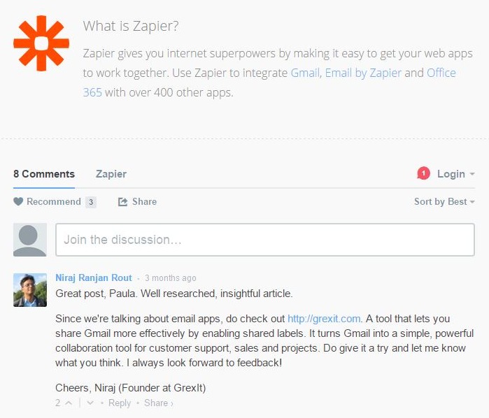
The comments tool at the end offers people a chance to give feedback, add suggestions, and thank the author. Comments are something you may wish to turn on in your church blog, but only if a) you’re going to respond quickly to posts and b) you’re unafraid to let people express themselves (within reason). Comments are most likely to be left by persons with strong feelings about an article–pro or con–so don’t turn them on if you can’t handle the heat. Be sure to experiment. Many websites are no longer using comment tools because people would rather leave comments within a social media post than on the post itself.
A Final Encouragement
There are many ideas you can take away from web pages, emails, ads and so on for your church if you simply start to look at them with fresh eyes. To help you do that, this article is the first in what will be an ongoing effort of this blog to bring clarity to your digital ministries.
Aboundant’s website platform is incredibly powerful because of its customizable nature. You could create a blog layout that looks much like Zapier’s or just about any other look you want to emulate. We hope you will consider taking a free 2-week test drive of Aboundant–the church website company that really wants you to learn the ins and outs of your website so that you can do far more with it than you ever dreamed possible.


