
Designing for Impact, Recognition, and Trust
Campaign signs are often the first visual encounter voters have with a candidate, making them a critical element of political marketing. They also represent the single largest expenditure for most local campaigns. A well-designed sign does more than display a name—it builds recognition, conveys professionalism, and earns trust. But what exactly makes a campaign sign great? Let’s dive into the key principles every campaign should consider when designing their signage.
Design Your Logo with Your Campaign Sign in Mind
When Aboundant designs logos for candidates, or any client for that matter, we always ask the question, “What is the logo going to be used for the most?” In a campaign, 9 out of 10 times it’s the campaign sign. This means you should be thinking about the campaign sign when you design your logo, and if you find it doesn’t work well on a sign, redesign it.
Here’s some questions to keep in mind:
- Does your logo typography use big bold fonts?
- Is your logo landscape oriented like the sign will be?
- Is there a version of your logo that works well with white text on a dark background?
Good campaigns create their logos with signage in mind from the very beginning.

Name Recognition is Everything
At the end of the day, name ID wins votes. Your campaign sign’s #1 job is to make your candidate’s name stick in voters’ minds. This means:
- Prioritizing the candidate’s name over all other text, it should take up most of the space.
- In most cases, this means the last name, with the first name taking second fiddle.
- Avoiding distractions like long slogans, job titles, or busy graphics
Remember, most people will see your sign for mere seconds—make sure the name is the one thing they remember.
Light Text on a Dark Background is Preferred
Readability is everything when it comes to signage, especially outdoors. Research and experience both show that light text on a dark background provides superior visibility, particularly during dawn, dusk, and inclement weather.
Popular and effective combinations include:
- White or yellow text on navy blue
- White text on black or deep red
Dark backgrounds also resist dirt and weathering better, helping your signs look sharp longer.
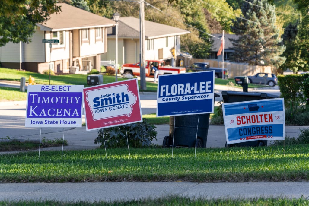
Use Bold, But Accessible Colors
Color is a powerful branding tool, but it must be used thoughtfully:
- Stick to bold, primary colors that grab attention
- Ensure colors are high-contrast and accessible for people with visual impairments (avoid tricky combinations like red and green)
- Stay on brand—use colors that reflect the candidate’s message and the tone of the campaign
Bright orange and green have become more popular in recent years, and are absolutely horrible for campaign signs.
To Bleed or Not to Bleed
In printing terms, a “bleed” means the design runs right to the edge of the sign, with no visible white border. While bleeding colors can create a modern, clean look, not all campaigns need it.
Consider bleeding if:
- You want a sleek, contemporary aesthetic
- Your sign uses a solid color background that extends to the edge
Consider no-bleed if:
- You want to save costs (bleed printing can be more expensive)
- Your design uses a white border, or if a border that reinforces your message
Both options can work—it’s about matching the design to the candidate’s personality and campaign tone.
Union Made
Campaigns are about values—and that includes how your materials are made. Using union print shops and proudly displaying the union bug (small printer’s mark) on your signs sends a message of solidarity and respect for labor. It’s especially important in areas where labor endorsements and union support are critical.
Bonus: Union printers often have extensive experience with campaign signs and can help ensure quality control.
Placement is Everything
Even the best-designed sign can fail if it’s placed poorly. Strategic placement ensures your signs are seen by the right voters:
- Focus on high-traffic areas (busy intersections, community hubs)
- Place the signs perpendicular to traffic, giving the driver more time to safely read the sign
- Get permission for private lawns, where voter endorsement matters
- Avoid clutter—make sure your sign stands out, not lost in a crowd of others
Always respect local ordinances and property rights. Nothing tanks goodwill like a sign placed where it shouldn’t be.
What Else Should be on the Sign?
Less is always more when it comes to campaign signs.
- The office you are running for is important, but in its briefest form. “For Council” instead of “For City Council 4th Ward”
- Any graphics should enhance the visibility of the name, not take away from it.
- If a slogan is vital to your campaign, use it, but nowhere as big or bold as the name.
- “Paid for” statements as required by law, but small and at the bottom of your sign.
Anything else you put on the sign is likely just “noise” as we say in design.
What about “Issue” Signs?
For issue signs, simply replace the candidate name with the issue designation and in brief instructions. “Vote No on Issue 4”, but stick to the rest of the advice.
Conclusion
A great campaign sign is more than a rectangle with a name on it—it’s a strategic tool that blends design, branding, and smart placement. By focusing on clarity, bold colors, union-made quality, and thoughtful positioning, your campaign signs can cut through the noise and leave a lasting impression on voters.
Are you ready to design a beautiful campaign logo? Aboundant’s digital designers have designed logos and websites for candidates ranging from town council and county races to state legislative and congressional campaigns. Check out our work here.